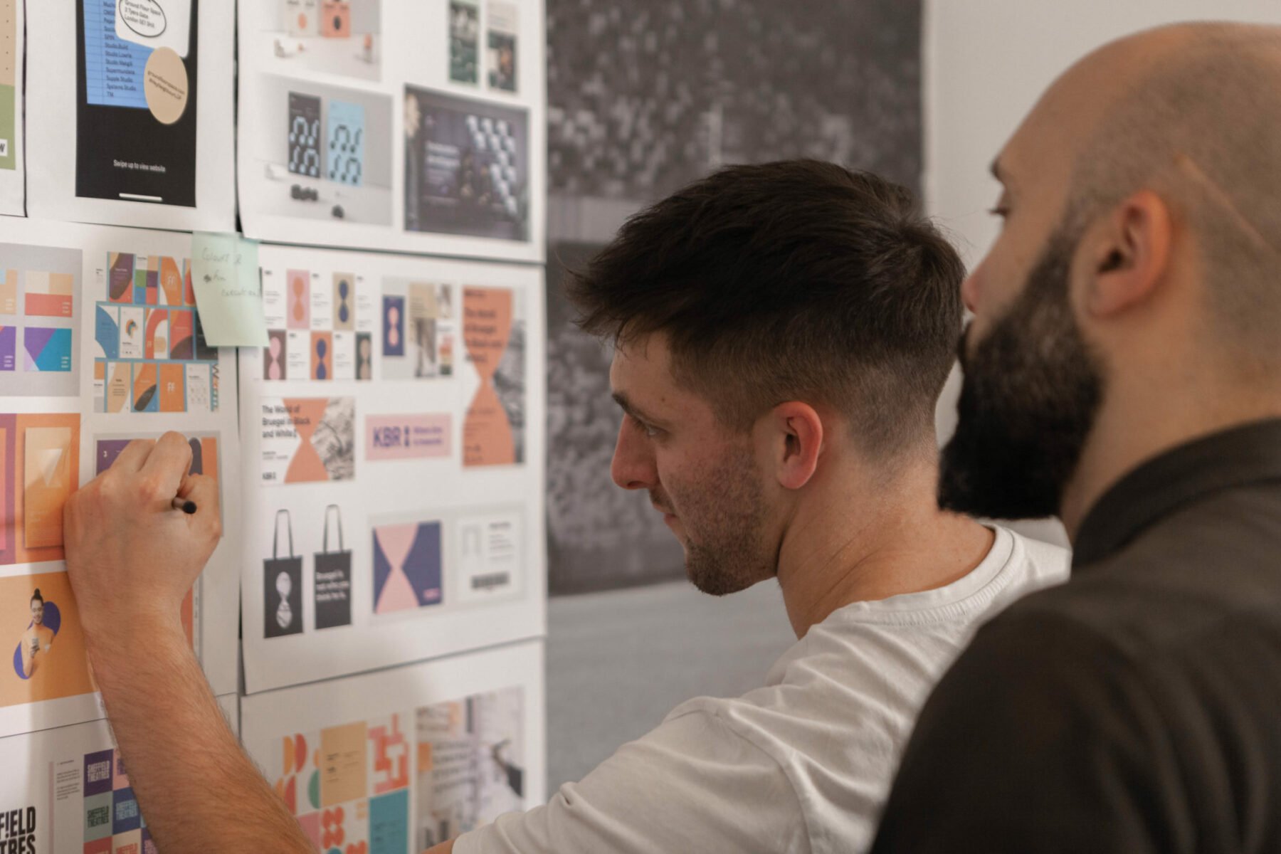
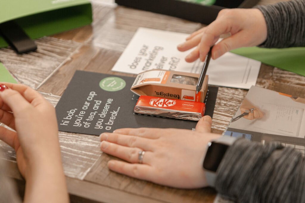
Improve your marketing with these design tips.

A marketing campaign is only successful if you can stand out from the crowd and captivate new customers. One of the ways you can do this is through design.
Whether you need product packaging, social media graphics, event collateral, or even a whole new website, the aesthetic will influence how your audience views your business, so it has to look good and reflect your brand well.
No matter how someone stumbles across your business, design is needed to make sure they like what they see and get a positive first impression.
Evidence suggests that the human brain processes images 60,000 times faster than text and what you see is much more memorable than what you read or hear. So, it’s important that your marketing collateral looks good in order to make a lasting impression on your audience.
What’s more, is that a good design makes your business look more legitimate and therefore more trustworthy. After all, nothing is more off-putting for a potential customer than a rubbish design that looks like it was done on Microsoft Publisher.
It’s worth making the investment to ensure your marketing materials show your business in the best light to secure audience interest and encourage conversions.

In design, less is more.
Whether this means taking out some of those CTA buttons on your website or keeping your social graphics simple, you don’t want to overcrowd your design. Make the most of the whitespace and keep it to a few simple elements.
If you have lots of information to convey for one campaign, don’t be afraid to use more than one channel. For example, if there’s too much to say in one social ad, why not make a dedicated landing page with all the nitty-gritty detail so your ads can focus on the headlines?
As we said before, the human mind is much better with pictures than it is with words.
Choose icons and images that portray what you need to say instead of including lots of text. And if you do include text, make sure it’s to complement the visual aspects, not to overpower them.
This will be much more memorable for the reader and is more likely to stand out compared to the competition.

Sometimes text is needed, and that’s okay as long it’s done right.
When including text, make sure it stands out against the background, is appropriately sized and the font is clear and readable.
All text included in a design should be engaging and follow the tone of voice for the campaign. And for everyone’s sake, please give it a spelling and grammar check before it’s used.
If you’re feeling confident in your design abilities, don’t be afraid to experiment a little with new ideas to make your assets stand out even more.
Have a go at using motion graphics or GIFs in your next design to make it more eye-catching and playful.
Well don’t worry, it’s what we do best!
We have a creative team of designers that know just what your business needs to stand out from the crowd. Get in touch to see how we can help you to take your marketing to the next level.