10 tips for creating a high converting landing page.
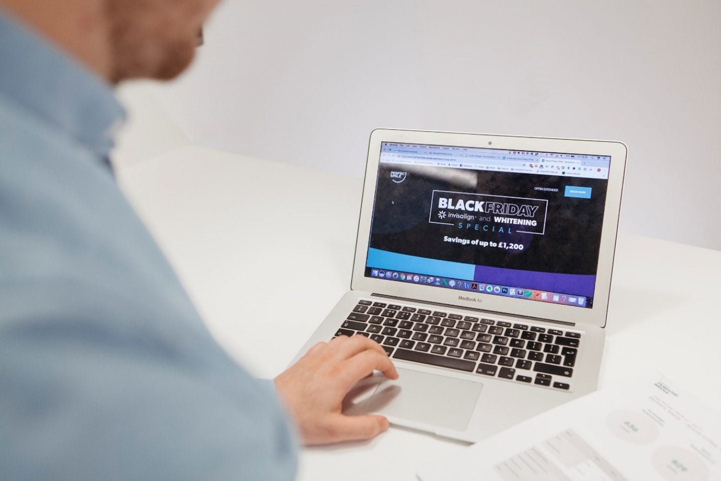
Landing pages are a great tool for getting new leads and conversions. They can be used to improve your paid ad campaigns, collect personal information, or to ‘warm-up’ your target audience by demonstrating how you can solve their pain points.
In this blog, we’ll cover everything you need to know about landing pages, including our top tips on getting high conversions and leads.
If you’re unfamiliar on what a landing page is, it’s a web page that’s targeted solely on encouraging a visitor to convert to a lead or customer. They need to keep the visitor focussed on completing one specific action or goal, such as filling in a form, downloading a document, requesting more information, or buying a specific product there and then.
They differ in comparison to a normal web page as they have no navigation, external links, or any other distractions which could prevent your audience from converting.
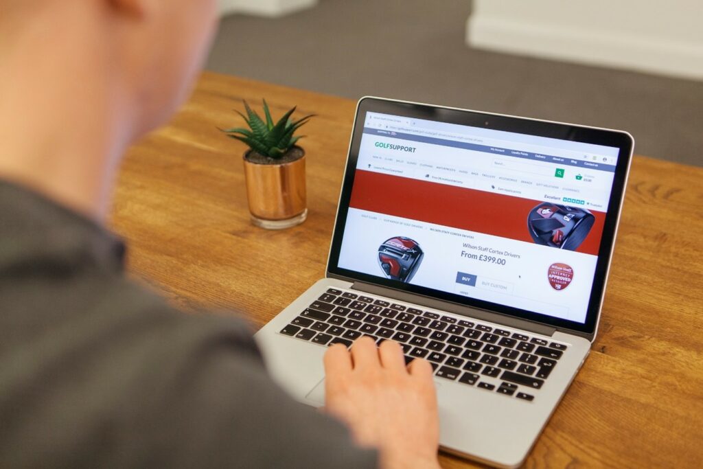
There are several different types of landing pages, but the main two are click-through and lead generation.
A click-through landing page is designed to warm-up your readers. It must grab their interest and answer their pain points to convince them to convert by completing your chosen call to action (CTA).
Whereas, a lead generation landing page targets customers at the beginning of the conversion funnel. The main purpose is to get them to enter their information. You need to carefully consider the information that you require, so that you can determine whether the lead is qualified or not.
If you’re looking to create a landing page for conversion, there are a few things that are a must.
Here are our top tips:
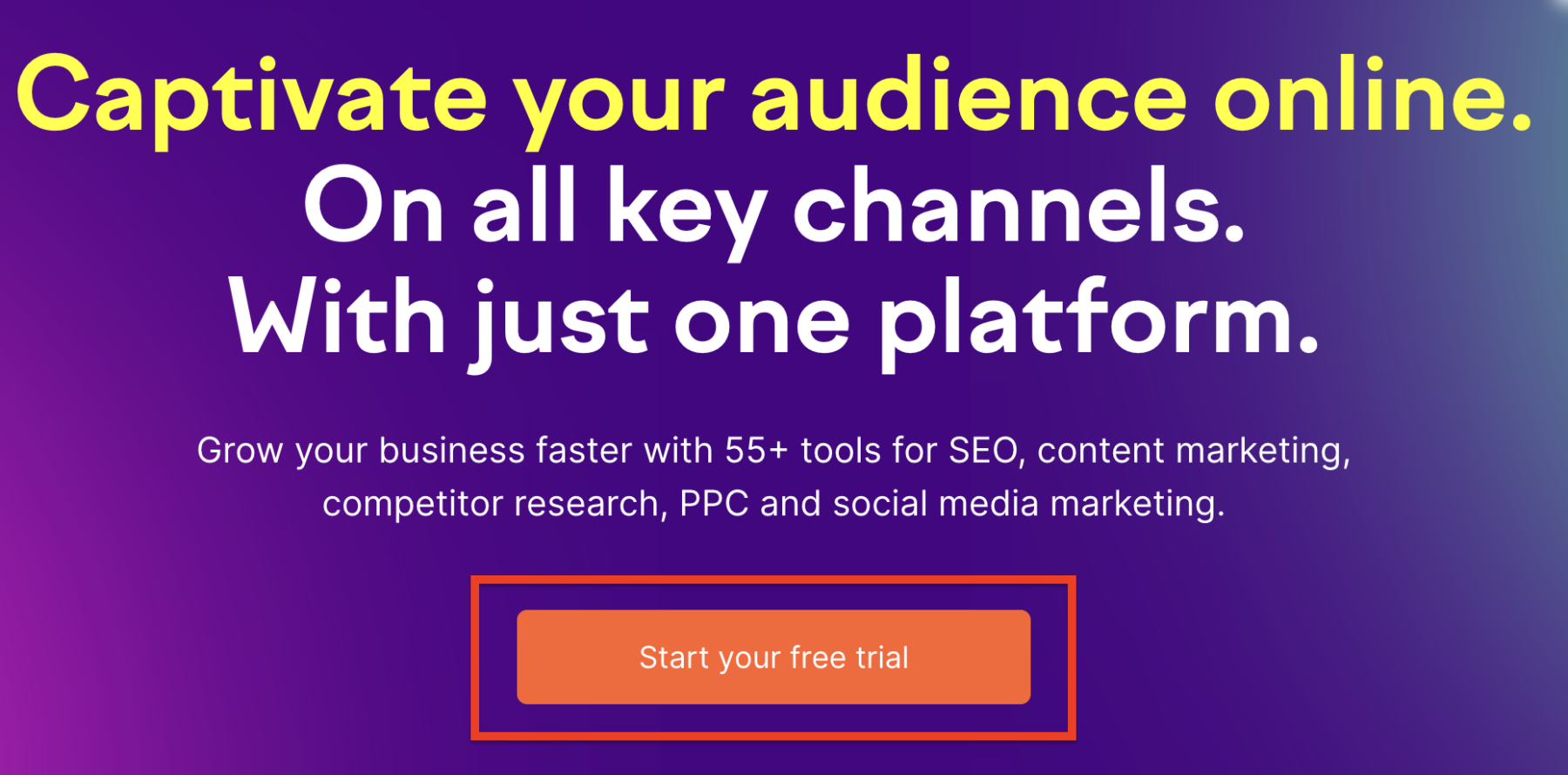
Make the conversion process as easy as possible by putting your CTA above the fold. This will help to provide a quick, clear and persuasive route to your desired outcome. It also draws your visitors’ attention straight away, especially if they may not scroll beyond the fold.
It’s still important that anyone visiting the landing page doesn’t have to scroll back to the top to click a button, so additional buttons should be placed appropriately throughout the landing page. This will enhance the user experience too.
Don’t ask your audience to do multiple things when they visit your landing page. Focus on one single CTA to avoid any confusion.
By having only one action, such as completing a form, downloading a brochure, or a click-to-call button, you are telling the potential lead exactly what you want them to do when they land.
Other CTA examples include, registering for an event or quote, or subscribing or signing-up to a product or service.
Having one CTA will also help you when it comes to measuring your results and nurturing your leads, as you know what they visited you for.
Before you create your landing page, you need to know who your target audience is. The page needs to be aimed at specific people who have specific needs.
Your content needs to be tailored to the right target personas, addressing how you can help solve their individual pain points. By directly addressing these, it will make it easier to get them to convert.
When drafting a landing page to be used as part of a PPC campaign, it’s essential to optimise for quality traffic over quantity. Otherwise, you won’t see desirable results. That’s why it’s so important to focus on your target audience and what they’re looking for.
We recommend writing content which is digestible, clear and punchy. If you’re re-purposing existing content from your website, make sure that it is condensed and straight to the point, so that it makes the most impact.
Refer back to our previous tip and ensure you’re targeting the right audience with your content by emphasising the key benefits of your product or service in a simple and concise way.
This will not only help to add value to your content, but it will also allow you to make the page niche to your target audience’s needs and requirements.
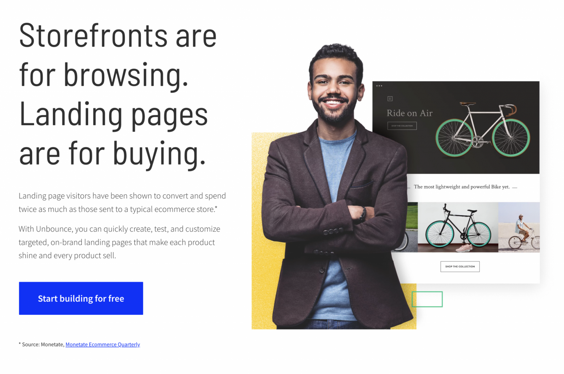
As soon as someone lands on your page, you need to grab their attention and encourage them to continue scrolling. This can be done by having your CTA above the fold, but also by including copy at the top of the page which keeps the reader intrigued and wanting to read more.
It’s worth considering how you can create a sense of urgency in your above the fold section too, which can help increase conversion rate. For example, you could announce a limited time only offer or a one-off discount for visitors.
When considering the layout and design of your landing page, user experience (UX) is key. It should be simple to use with limited distractions. We’d suggest removing any navigation and internal links which don’t lead your reader to converting.
Look at your landing page and ask yourself if everything currently on there is necessary. If not, remove it or condense it.
Consider where the majority of your traffic will be coming from. If most of your traffic is from mobile users, you should also review how your landing page looks on phones, not just desktop. Again, this will help to improve the UX.
If you’re targeting a potential new audience that you haven’t marketed to before, they need to know why they should choose you.
In order to build trust, you can include credibility signals, like testimonials, reviews, case studies or logos of the brands you work with.
Adding these will help to increase confidence with the audience, especially if they’re viewing your brand for the first time.
The effectiveness of optimising your landing page is dependent on your chosen channel and campaign.
You should always make sure that your landing page matches the key terms that people are searching for in order to provide a consistent user experience.
If you’re using your page as part of a PPC campaign, it’s good practice to match your landing page to the terms that you are targeting to help with your quality score.
A landing page which focuses on relevant keywords for SEO can assist in improving your organic search traffic. A specialist team can help identify the most relevant terms for your product or service that you’re trying to promote.
If a visitor has to wait too long for your landing page to load, they will click off before they convert.
According to research, half of web users expect a site to load in two seconds or less, and nearly half of web users tend to abandon a site that hasn’t loaded within three seconds.
This means that you need to test and increase your page load speed where you can to avoid destroying your conversion rate.
Finally, we’d recommend A/B testing your landing pages to see which get the best conversion. A/B testing is where you compare the performance of two landing pages by changing one single element between the two.
This could be done by swapping an image for a video, or using a different CTA. Once you have the results, you will know which is the most successful. This information will be useful for when you build any future landing pages.
As with any digital marketing campaign, you need to continuously review and analyse your results, including whether your landing page is generating the right type of leads.
Depending on the purpose of the page, we usually track; page visits, form completions, number of leads and bounce rate to paint a better picture of how well they have performed.
At Purpose Media, we have the expertise to write and build landing pages which get you leads.
Our team of marketing strategists, creative copywriters and designers are on hand to help you achieve your goals and objectives. Get in touch today to find out more.